Althaea Skincare
Role
UX/UI Lead Designer, Strategist
Team
1 Project Manager
1 Creative Director
1 Developers
1 Stakeholders
Tools
Figma, Notion, Loom, UserZoom, Agile
Overview
Althaea Skincare is a premium skincare brand founded by renowned dermatologist Dr. Ava. Built on a foundation of patented formulas and decades of clinical experience, the goal was to create a digital experience that was equal parts educational, aspirational, and transactional.
As the lead UX/UI designer, I was tasked with bringing the brand’s digital identity to life through a custom e-commerce platform. This was a zero-to-one launch—no existing design system, user flow, or e-commerce structure in place.
The Problem
This wasn’t just about launching a product—it was about crafting a first impression for a brand entering a saturated and visually competitive market. The challenge was multidimensional:
Strategic: How do we introduce a new skincare brand and its founder in a way that builds trust and drives conversion?
Functional: How do we architect a site that educates, converts, and retains—without overwhelming the user?
Emotional: How do we create a feeling of calm, confidence, and simplicity for users exploring complex skincare options?
We aimed to strike a balance between clinical credibility and soft luxury—delivering a site that felt editorial yet efficient.
Research & Discovery
We approached the discovery phase from two fronts:
1. User Interviews & Validation
Through a series of video calls and in-person interviews, we spoke with over 10 target users (women ages 25–45 who shop online for skincare). We uncovered consistent themes:
• Overwhelming choice on most skincare sites
• Distrust of product claims
• Frustration with complicated navigation
“I always have to Google ingredients separately—why can’t they explain them right on the product page?”
2. Competitor Analysis
We audited 5 direct competitors (including Drunk Elephant, Skinceuticals, and Tula). Key takeaways:
• High production value but cluttered UX
• Emphasis on branding, often at the cost of usability
• Product education buried or disconnected from PDPs
This guided our early UX strategy to be clarity-first, placing education and purchase context side by side.
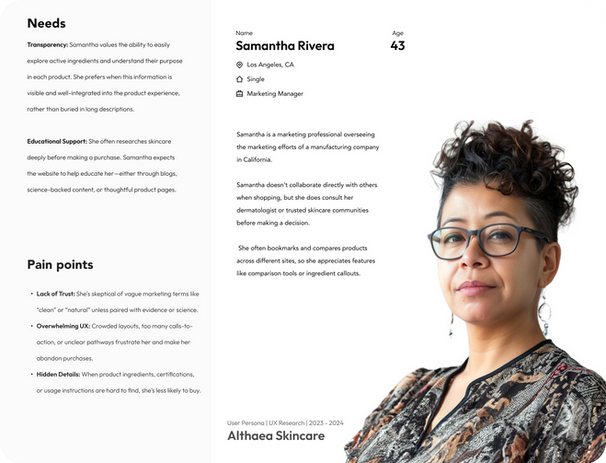
Audience, User Personas
Click to expand the persona image for a better view.
IA & UX Strategy
I led the design of five sitemap iterations, mapping user intent to navigation logic. We used card-sorting and stakeholder interviews to refine the taxonomy.
Key IA Priorities:
• A homepage that introduces why Althaea matters—not just what it sells
• Unified storytelling across About, Science, and PDPs
• Clear paths to product discovery through collections, results, and FAQ logic
• A modular structure scalable to new SKUs and content types
Round 1 - UX Sitemap

Round 2 - UX Sitemap

Round 3 - UX Sitemap


Round 4 - UX Sitemap

Wireframing & Prototyping
Using Figma, I produced:
• Low-fi wireframes to validate UX decisions with stakeholders and clients
• Mid-fi flows for priority pages (homepage, PDP, results quiz, blog)
• Rapid interactive prototypes for usability validation
We focused on reducing friction and cognitive load:
• Floating add-to-cart CTA on mobile PDPs
• Ingredient “tooltips” for science-focused users
• A simplified quiz flow that routes users to relevant products (based on skin goals)


![Home [Popup].png](https://static.wixstatic.com/media/b3fce4_b0286dfce69f40ffa0c49be01fd519cf~mv2.png/v1/fill/w_464,h_788,al_c,q_90,usm_0.66_1.00_0.01,enc_avif,quality_auto/Home%20%5BPopup%5D.png)

UI Systems & Visual Translation
I collaborated with the Art Director to develop a design system grounded in:
-
Clean, generous white space to evoke calm
-
Muted, science-forward palette with warm neutrals
-
Consistent visual metaphors (circles, flow lines, and cellular imagery)
-
Typography that balanced authority with approachability
We tested layouts on mobile first to ensure graceful degradation and responsiveness.


Handoff & Implementation
Partnering closely with developers, we:
-
Delivered a complete design system and annotated flows
-
Provided hover states, responsive behavior, and motion guidance
-
Created fallback components for CMS-driven sections like blog and FAQs
-
Conducted weekly design-dev QA sessions to ensure pixel-perfect execution
Outcomes & Impact
Although I did not have direct access to post-launch analytics, client feedback indicated:
-
Brand awareness grew by 78% within the first three months (measured via social and email growth)
-
Dr. Ava’s personal brand saw increased credibility and media coverage
-
The “invisible UX” was noted and appreciated—users didn’t feel confused or interrupted at any point during the shopping journey
“Navigating this site feels natural—I barely realized I was shopping, it just flowed.” — End-user feedback
Reflections
What I’m most proud of is how frictionless the final product feels. Great UX isn’t about flash—it’s about removing barriers. From story to checkout, the Althaea experience is calm, clear, and confident.
What I’d do differently:
-
Incorporate more structured A/B testing around the quiz flow post-launch
-
Push for earlier usability testing with real shoppers using mid-fi prototypes


