

EGA App
Role
UX/UI Design Lead
Tools
Figma, Mark.io
Overview
Elsa Gonzalez & Asociados is a broker insurance company based in the Dominican Republic. Customers can choose from a variety of insurance products offered by the company, which has several offices across the country.
These include coverage for cars, homes, electronics, health, and more. The COVID-19 pandemic resulted in an increase in cases, making it necessary for consumers to have better access to basic information about products, coverage, help, and support.
The problem
-
Due to an increase in cases, the company's staff was unable to handle the daily calls and claims.
-
Many people in the country don't have access to fast internet speeds. Providing a solution that loaded the company's products quickly was imperative.
-
The consumer needed a way to find out more about products, browse the company directory, and chat online. While the website offers a lot of information, consumers want a simple and quick way to access the company's product.
Research & Discovery
Understanding the culture and how apps are used in the country was one of the biggest challenges. It may seem strange to say, but UX practices differ for users, audiences, and even countries. The Dominican Republic, while being a technologically advanced country, doesn't rely as heavily on technology for offering services as the United States, e.g. creating online claims, talking to bots about insurance policies, etc.
Therefore, audiences and users are accustomed to engaging in face-to-face communication with services rather than checking all data online for convenience. It is simply not used as often, not due to a lack of technology, but because it is not a cultural practice.
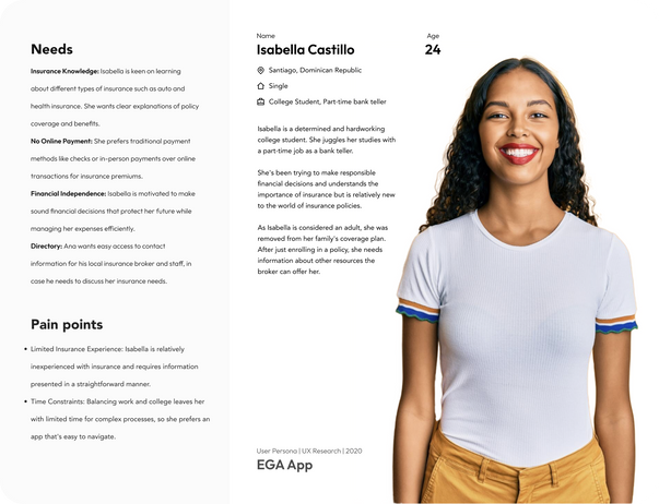
I used a variety of tools and methods to conduct extensive research and understand the country's users and audience. Data was collected by polls, Google forms, and in-person short surveys while consumers visited the company's offices. A solid user and persona research study helped determine the UX path used to design the app's interaction and to ensure success while meeting the business goals. The following are key user personas based on research.
Audience, User Personas
Click to expand the persona image for a better view.
Key findings, Insights
Following are insights and findings that helped determine the app's functionality and goals based on consumer feedback.
-
Total Number of Survey Respondents: 672
-
With 35% of users emphasizing User Interface Design, it is the most frequently mentioned topic. Clearly, users care about the app's aesthetics and visual appearance.
-
Ease of Navigation is the second most mentioned, with 60% of users highlighting the importance of intuitive and easy-to-use navigation within the app.
-
15 percent of feedback relates to information clarity, indicating users value concise information presentation.Having access to all of the company's departments' phone numbers and the lead person in charge will ease the burden of waiting on the line for the right person for most customers.
-
Features and Functionality represent 20% of the feedback, emphasizing the importance of decent features and useful functionality within the app.
Ideation and Design
To ensure consistency with the overall brand and tone, the UI should not presume disconnection. Some small details, however, had to be different from the branding to ensure accessibility. Typography and contrast proof colors needed to be slightly more user-friendly and readable.
Unlike those in production, this app does not contain any login features or other autonomous user actions. As long as patterns and standards are followed, the structure may be unique.
As a starting point, I got my ideas in grayscale to understand the best layout and placement for an effective information architecture.


Low fidelity mockup of a possible layout and structure outcome.

High fidelity mockup of a possible layout and structure outcome highlighting blocks as way to presumer a quicker call to action rather than listings.


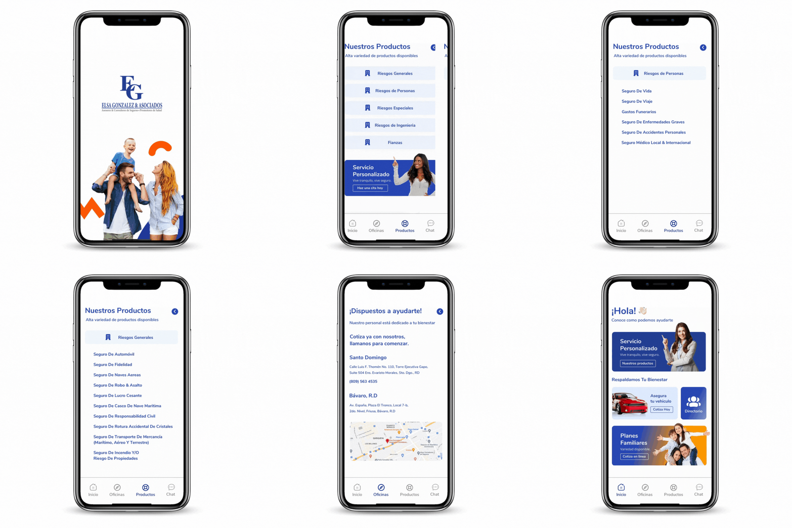
One of the main "concerns" collected during the UX surveys was that the UI looked interesting and nice. In addition, the UI must be bold enough to grab the user's attention right away. Featuring a few key screens, the "landing" screen shows the most frequently asked actions regarding the company, such as products, calls, and claims.
Compared to the original mockups, the final UI looks different, as feedback was received that lists and tabs seemed too traditional and overwhelming rather than sections with images to grab users' attention.This helped me to create a different UI that resembles an easier layout and structure for displaying product information, calls to action, etc.
The app's user interface was carefully crafted to provide an intuitive and straightforward experience. Ensuring that the content was presented in a clear and understandable manner, especially for users who may not be familiar with insurance jargon was crucial.
![intro[intro_once].png](https://static.wixstatic.com/media/b3fce4_863a6ec82fb2440bbe02384f8879541a~mv2.png/v1/fill/w_244,h_529,al_c,q_85,usm_0.66_1.00_0.01,enc_avif,quality_auto/intro%5Bintro_once%5D.png)


Conclusion
The importance of creating a user-centric and accessible platform cannot be overstated. In this UX/UI case study, we explore our journey in designing an app that prioritizes user needs. There could have been a quick fix by designing based on a template, but this would not have worked since it is not tailored to the users' needs.
The primary objective was to design an app that simplifies the complex world of accessing information about the company's products and resources, making it easy for users access insurance offerings and directory without the need for online payments or user accounts.
Throughout the design process, thorough research was conducted and leveraged user feedback to inform decisions.
We created detailed user personas, identified pain points, and worked diligently to address them.The commitment to user privacy and security remains unwavering, with no online payment or login accounts to safeguard and respect the user's information.
Since the app was released I have witnessed increased engagement and satisfaction ratings, reinforcing the belief that a user-centered approach is key to success for this particular project.
The future plan is to scale the app to include in-app forms for ease of interaction, most likely a research will happen to determine if the app is in need of account creation and automatically quotes.


