.png)
%20(Instagram%20Story)%20(Instagram%20Post%20(Square))-4.png)
Evolve Labs
Role
UX/UI Design Lead
Team
1 Project Manager
2 Developers
3 Stakeholders
Tools
Figma, CSS, Velo
Overview
EvolveLAB is a technology company committed to making a difference in the industry by innovating the process of designing, constructing, and operating better buildings through technology and building information management.
As building technology professionals, they exert influence and mentor designers, contractors, and owners. EvolveLAB is dedicated to training, educating, and providing guidance to all stakeholders in the construction field.
The problem
-
From a customer's perspective, Evolve's website is difficult to navigate and find the right information.
-
To provide their extensive product offerings while providing a better experience with wayfinding products, evolve needs to improve their product presentation and journey flow.
-
Despite Evolve's product being aimed at professionals in construction and architecture, the language used should be simple enough for both types of audiences to understand.
Research & Discovery
In preparation for this project, the internal team at Evolve already had some feedback and research for a new design and navigation. This was done by their internal marketing team.
As part of the UX analysis and research process, one of my first tasks was to redesign the information architecture first, since that seemed to be where the main pain points were. Navigating the website was very confusing, and the company's offerings and industries were unclear. Creating an intuitive information architecture and mapping out individual pages was the solution.
By organizing all of the products under a single tab as well as displaying the e-commerce products independently, the sitemap showcased an improved and clear navigation of the website. Instead of focusing on content, the first round of the sitemap was to stabilize navigation and organization. We reduced the size of the website by 75% using the proposed information architecture and sitemap structure.

First round of UX sitemap
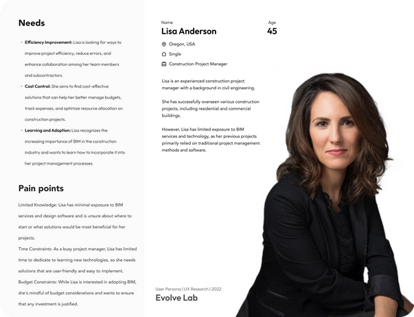
Although Evolve was already aware of their audience and persona, we as designers needed to learn more about them.While we know not everyone will navigate to this website without much information about BIM services and design software. However, managers of companies or recruiters for contracts are likely to navigate websites like these to obtain the necessary information despite not being subject matter experts.
This was the reason we dived a little deeper into personas. By doing this, they will be able to provide a seamless and intuitive UX design to their website.
Audience, User Personas
Click to expand the persona image for a better view.
After evaluating the needs, goals, and technical/professional backgrounds of the personas. We understood that information must be free of technical jargon for both subject matter experts and for those who deal with these products every day. All users, regardless of their professional background, should have easy access to the website's content.
Ideation and Design
Now that the UX phase had been completed, it was time to move on to the aesthetics and UI of the website. Evolve's internal marking team had specific criteria as to what the website should look like or at least include certain elements that their audience was already accustomed to, such as logos, color scheme, etc.
As part of the design process, I didn't want to jump straight into high fidelity designs as there were a lot of options for how the UI could look. Layout and content structure had to be clarified before moving on to UI elements and colors.
Content structure and layout of the new website are represented by these wires. Keeping everything grayscale allowed us to make notes, iterate, and switch between sketches without getting attached to one version of the design. This factor also helped the company's stakeholders to scale a broader vision of the final product.
Round of wireframes


With the prior UX research work done for the information architecture, presenting the wires and following the layout structure was easier than expected. This step allows us to determine the content layout and how it will be displayed in the updated visual aesthetic.
After presenting this to Evolve's stakeholders, there was little pushback, as the structure seemed well organized and the content displayed matched their vision. Integrating the UI elements of Evolve's software was one of the most important criteria for the new design. It is important for stakeholders for the website's UI to match their software UI in terms of buttons, colors, fonts, etc.


%20(Instagram%20Story)%20(Instagram%20Post%20(Square))-4.png)
Conclusion
In redesigning the Evolve website, our primary goal was to create a user-centric digital experience that not only reflects the values and expertise of EvolveLAB but also serves as a valuable resource for their audience. Through an iterative design process driven by user research, collaboration, and a commitment to the end suer, we have successfully achieved this objective.
The new UX/UI demostrastes innovation, clarity, and user satisfaction. We have addressed several key challenges and opportunities:
Enhanced User Experience: We focused on creating an intuitive, user-friendly interface that guides visitors seamlessly through the website. Clear navigation, accessible content, and an aesthetically pleasing design have contributed to an overall improved user experience.
Engaging Content: We have enriched the website with valuable content, educational resources, and informative articles. These additions provide users with a deeper understanding of EvolveLAB's expertise and the evolving world of BIM and REVIT design technology.
Responsive Design: The website is now fully responsive, ensuring that users can access it from various devices and screen sizes without compromising on functionality or aesthetics.
Visual Cohesion: The new design aligns with EvolveLAB's branding, offering a consistent and professional visual identity across all pages.


